Light vs. Dark: Choosing the Right Value for Your Rose Tattoo
A masterclass in using Contrast for depth and longevity
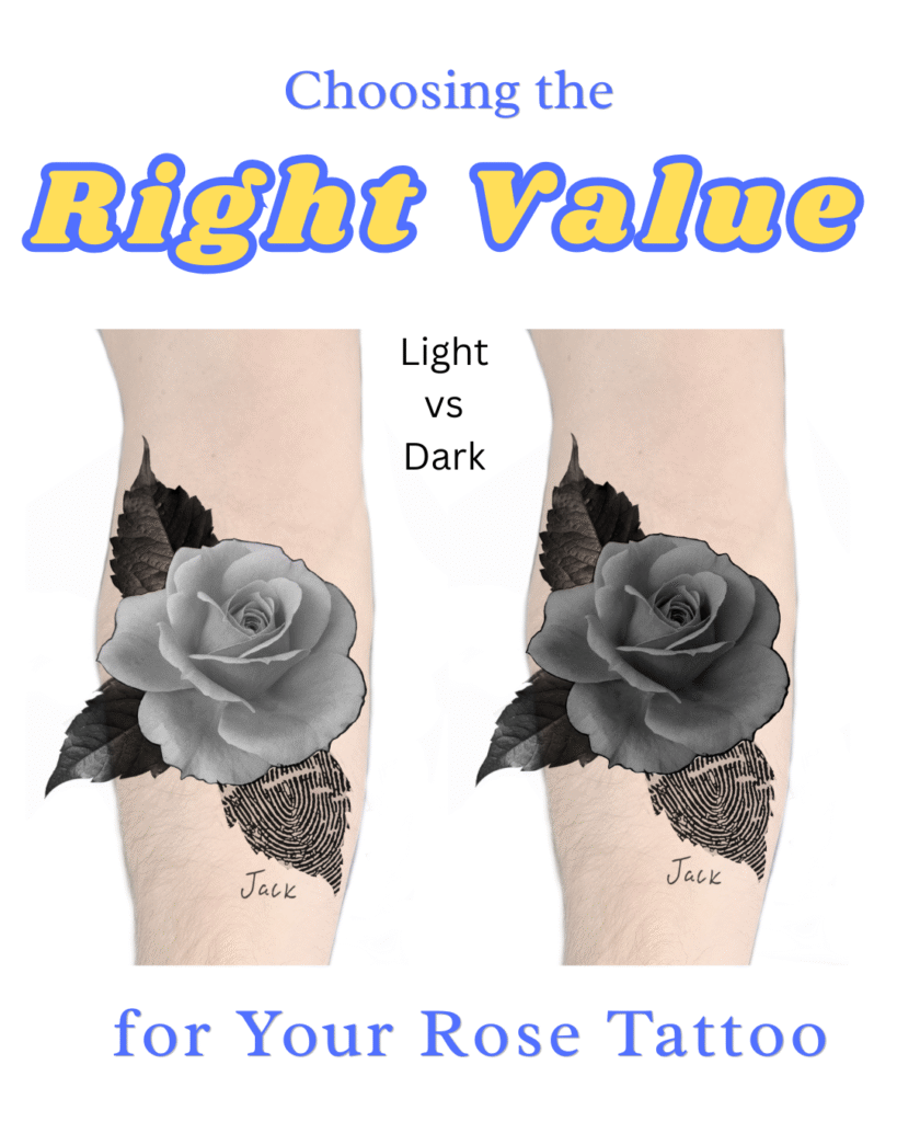
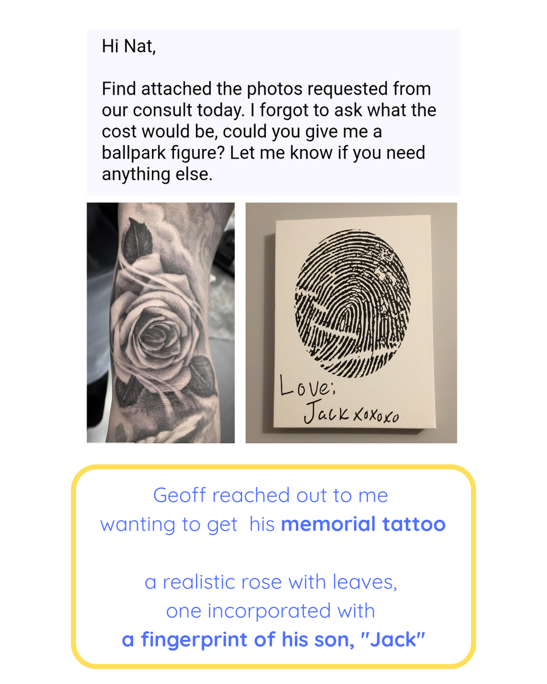
When Geoff reached out to me about his memorial tattoo, a realistic rose sitting over a fingerprint of his son, “Jack.”


So, it’s a perfect case study in the “Value of Contrast.”
The Client’s Vision: Deep & Atmosphere
My client, Geoff, loved the design but had a specific request: “Is it possible to have more shading in the flower? I would like it darker.”

A darker rose tells a different story. It’s moody. It’s dramatic. Instead of the flower “popping” out, the whole tattoo feels like one solid, beautiful piece of art. It’s heavier and feels more “brooding.” It’s striking because of how deep and permanent it looks.


But what happens if I push the values in the opposite direction?

By prioritizing ‘Light’ over ‘Weight,’ I shift the focus toward separation and long-term readability.
My Perspective: The “Pop” Factor

Contrast is the “Magic” in Tattooing
Imagine a light rose set against deep, dark leaves.
It’s like turning on a spotlight in a dark room; your eye is instantly drawn to the bloom.
Because the surrounding values are so heavy, the petals appear soft and glowing, almost as if they are lifting off the skin.
In a memorial piece, that luminous center carries a special weight.
It isn’t just the light value that creates the focal point; the very shape of the rose pulls you in as well.
The Value in Contrast is just 1 type, if you want the other 9: The 10 Types of Contrast in Art

From a composition standpoint, the light rose is a “win.” Why?
- Separation: The light petals pull forward, while the dark leaves recede.
- Readability: Even from across the room, the rose’s silhouette is crystal clear.
- Longevity: Lighter values give the tattoo “room to breathe” as it ages.

The Final Word: It’s Your Skin
Whenever I work with a client, I will always explain the “why” behind my artistic choices. I’ll talk about how values interact and how skin tone affects the final look.
But at the end of the day? It is your body. I moved forward with the darker version for Geoff because that’s the version he connected with. As an artist with 20 years in fine art, I can provide the map, but you’re the one who has to live in the destination. We landed on a beautiful, rich rose that he loves, and that is the ultimate goal.
